How to Make Your Website Background Image Responsive

Building a website is no easy task. There are so many little details to stay on top of and they all matter when it comes to using your website to serve whatever purpose you had in mind for creating it.
When it comes to developing and maintaining a website, one of the most important details is its responsiveness in adapting to various browsers and devices.
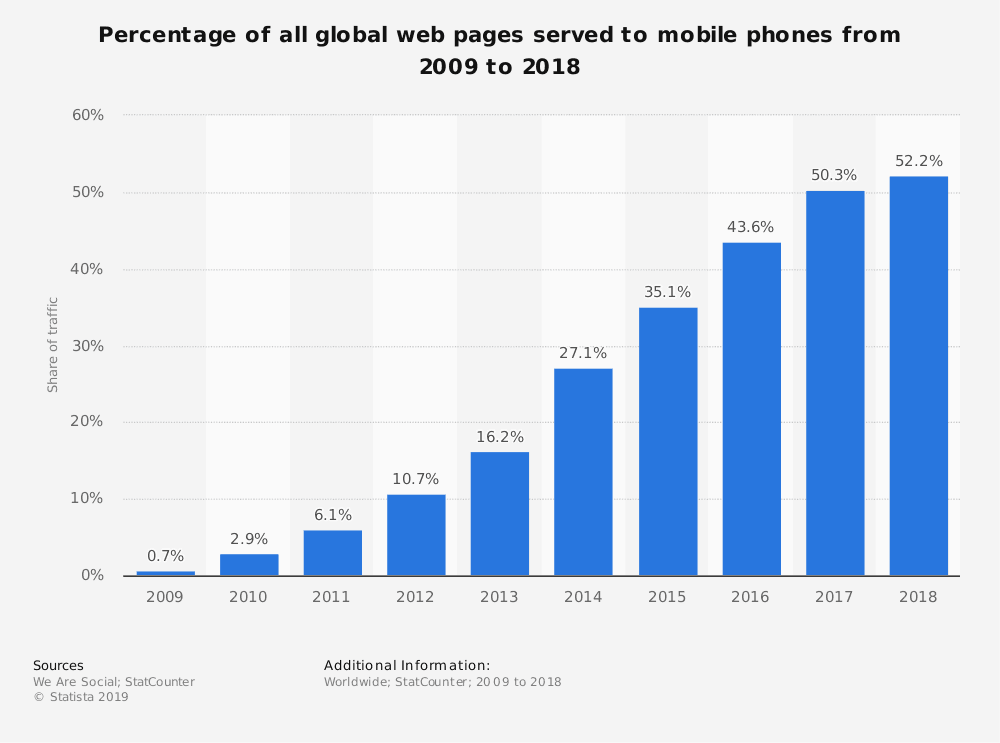
In 2018, about 52.2% of all website traffic worldwide was generated through mobile phones — a number that is consistently trending upwards.
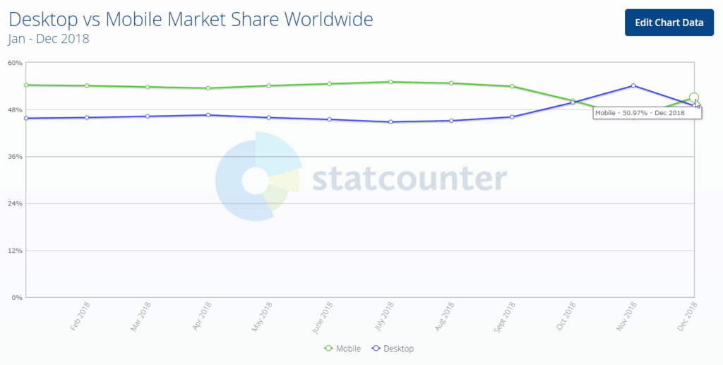
Furthermore, global mobile market share boasts of an average larger percentage compared to desktop market share throughout 2018.
The implication is clear: if your website isn’t responsive, you’re alienating a majority of internet users who likely won’t stick around for the subpar user experience offered by your website.
An important part of achieving responsiveness across devices and browsers revolves around how your website background image scales.
Full-Screen Website Background Images Look Great
Many popular websites make use of large, full-screen background images.
Here are a few examples of websites using large website background images to give you some design inspiration:
Full-screen background images look beautiful and elegant on desktop browsers but oftentimes, this same effect doesn’t translate to mobile devices without some modifications on your part.
Let’s take a look at some of the ways you can make full-screen background images responsive to different devices and browsers using CSS and other methods:
Guidelines for Choosing a Full-Screen Website Background Image
As a general rule, the background image you choose should have high resolution so that it doesn’t lose quality as it scales for various screen sizes.
Browsers can generally make an image smaller without compromising quality. However, when a browser scales up to an image size that is larger than your original website background image dimensions, this will result in a visible quality downgrade. If you use a large image, scaling down to a smaller size won’t involve a similarly noticeable downgrade in quality.
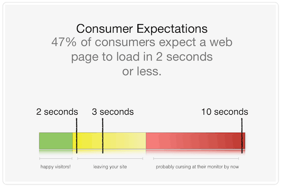
The downside of using a fairly large background image is that it can cause your website to experience a speed performance downgrade. According to statistics, 53% of visitors will abandon your website if it takes more than 3 seconds to load.
(Source, above link)
These problems become worse for someone accessing your website on a mobile device that might have a spotty internet connection.
Luckily, there are a few things that you can do to correct for the problems created by using a high-resolution website background image.
First, use the CSS media query to provide mobile devices with an alternate smaller background image. This simple step can enhance the page load speed of your website on smaller screens. Correctly implementing the media query will serve a scaled-down version of the background image file so that you won’t risk downgraded website performance.
Here’s an example of the CSS media query you’ll want to customize for your website:
@media only screen and (max-width: 767px) {
body {
background-image: url(your-image-url-here);
}
}
Second, consider using image optimization tools like ShortPixel or Smush to decompress large images without sacrificing image quality, resulting in faster page load speeds.
Changing Your Mobile Background Image Size Using CSS
It certainly isn’t easy to ensure that your website background images will look good regardless of the screen sizes and orientations that people use to access your website. But in many cases, using relevant CSS codes can help or solve the problem completely.
Specifically, try changing the background-size property to create responsiveness. In this case, you’ll want your CSS code to reflect the following change to get your full-screen background images to cover the entire viewport of the website:
background-size: cover;
The cover CSS property tells the browser to automatically scale the background image’s width and height according to the viewport, regardless of how large or small it is. The image scales to cover the entire viewport, but it will not change the original proportion and aspect ratio of the image, thus preventing it from being distorted.
Using this CSS code, the image will always be equal to or greater than the viewport so that it can cover the entire surface, leaving no blank and white spaces.
When incorporating this CSS fix, associate it with the body element from within your HTML code so that it will always cover the entire window viewport (unless you want to use a full-screen background image that’s limited to one specific page element).
The resulting code will look something like this:
HTML code
<!doctype html>
<html>
<body>
This is where your main content goes.
</body>
</html>
CSS code
background-image: url(your-image-url-here);
background-position: center center;
background-repeat: no-repeat;
background-attachment: fixed;
background-size: cover;
background-color: #464646;
It’s worth taking the time to understand the following CSS considerations shared in the above code example:
- background-position: center center; –This helps ensure that your website background image always centers in the window.
- background-attachment: fixed; – This helps you to avoid a scrolling image when the background image’s height is greater than the visible window height. The image will stay fixed when users scroll through your website.
Changing Your Mobile Background Image Size Using a Plugin
For those that aren’t web developers by trade, tweaking your CSS and working in the backend of your website can be a bit intimidating. Fortunately, if you use WordPress, there’s a simple solution for enabling a responsive full-screen website background image without needing to edit your CSS code.
Full Screen Background Images is a WordPress plugin by Amplify Plugins that allows you to add an unlimited number of full-screen background images to your website in very simple steps.
The features included with Full Screen Background Images are:
- Scaling to fit,which ensures that background images will automatically scale according to the visitor’s browser and device, no matter the size. The images scale live as the browser is resized, making your background images responsive across any device.
- Showing images on any page. You can specify different images to show on different WordPress pages, posts, categories, and more — or use one global image everywhere on the website.
- A simple interface that works seamlessly with most WordPress themes and plays well with other plugins.
- Slideshow functionality.You can also choose multiple images to create a slideshow or create continuity with one image throughout the website.
Final Thoughts: How to Make Your Website Background Responsive
Thanks to the growth of mobile device usage, it’s important to always optimize your website in terms of responsive design. Don’t neglect to conduct mobile and browser testing before launching your website (or after making any major changes). These efforts help to ensure that everything works smoothly, while helping you to avoid having your brand associated with a bad user experience.
Do you still have questions about the proper incorporation of website background images? Let us know by tweeting us at @fullscreenbgimg — we’d be happy to help!